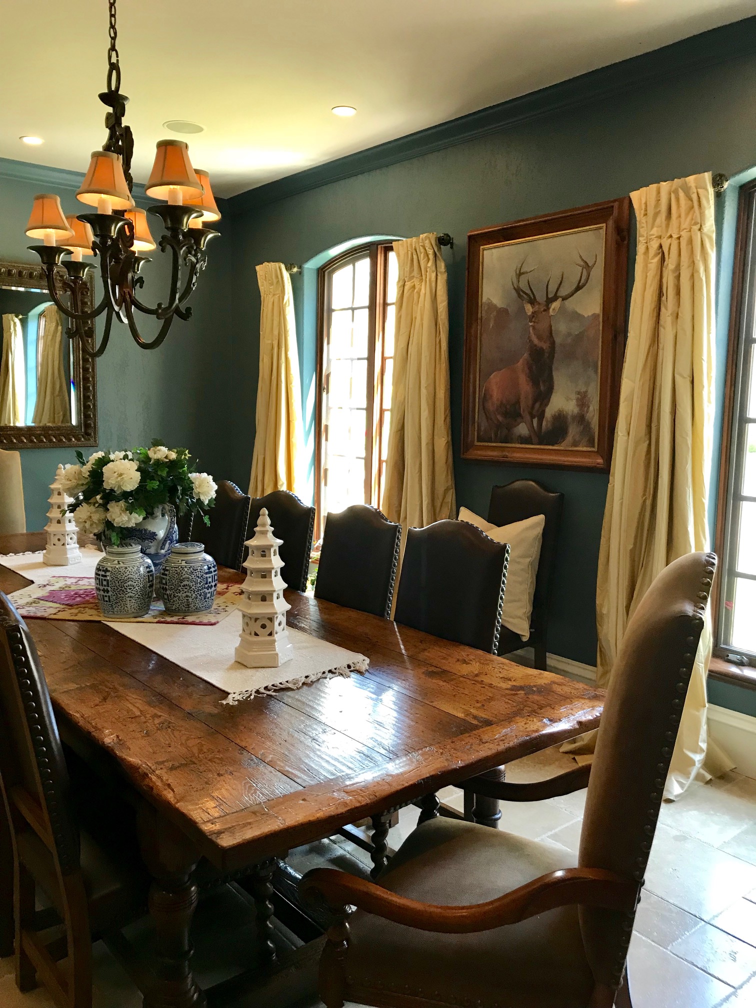
Tablescaping, an example…

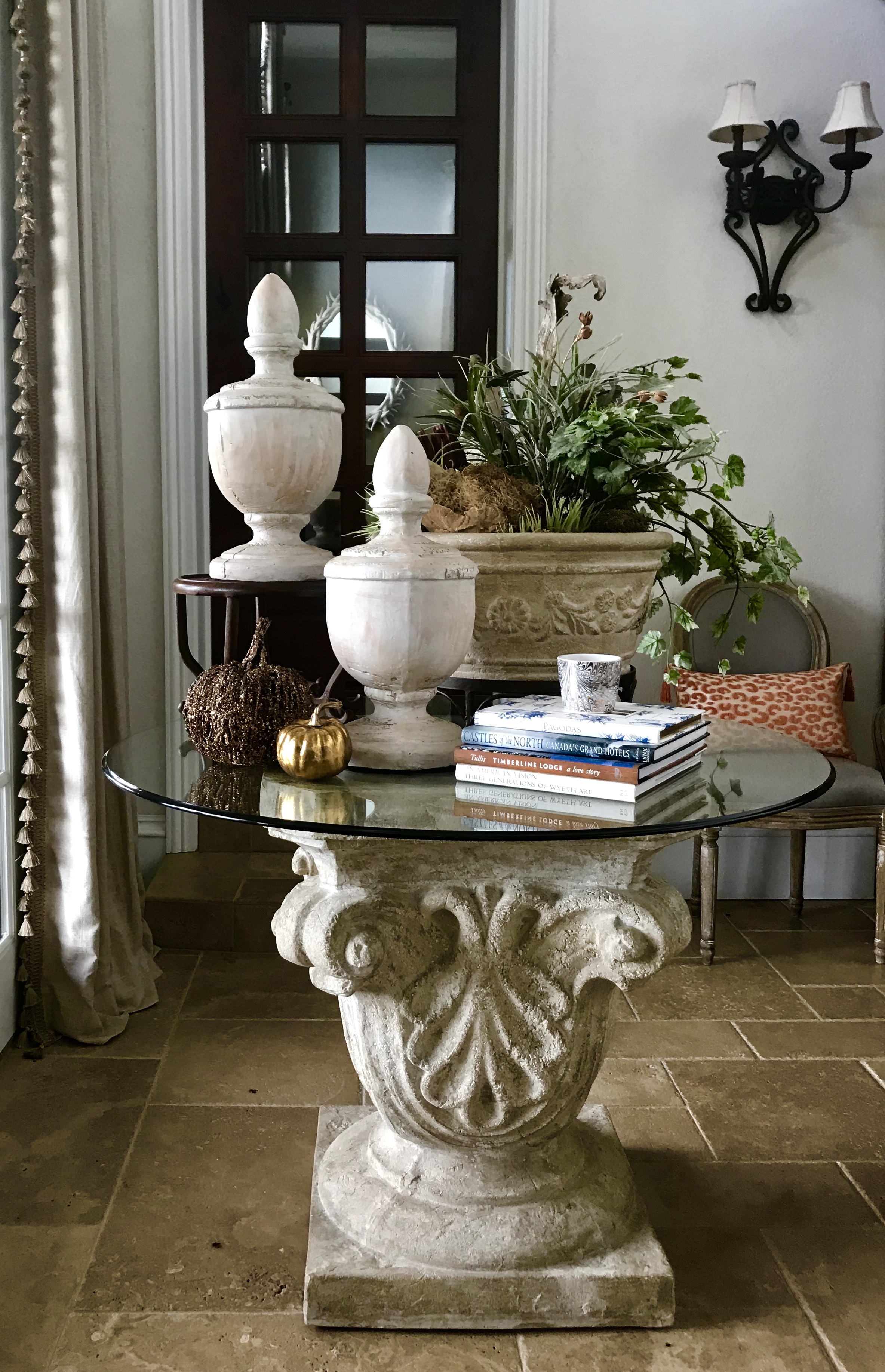
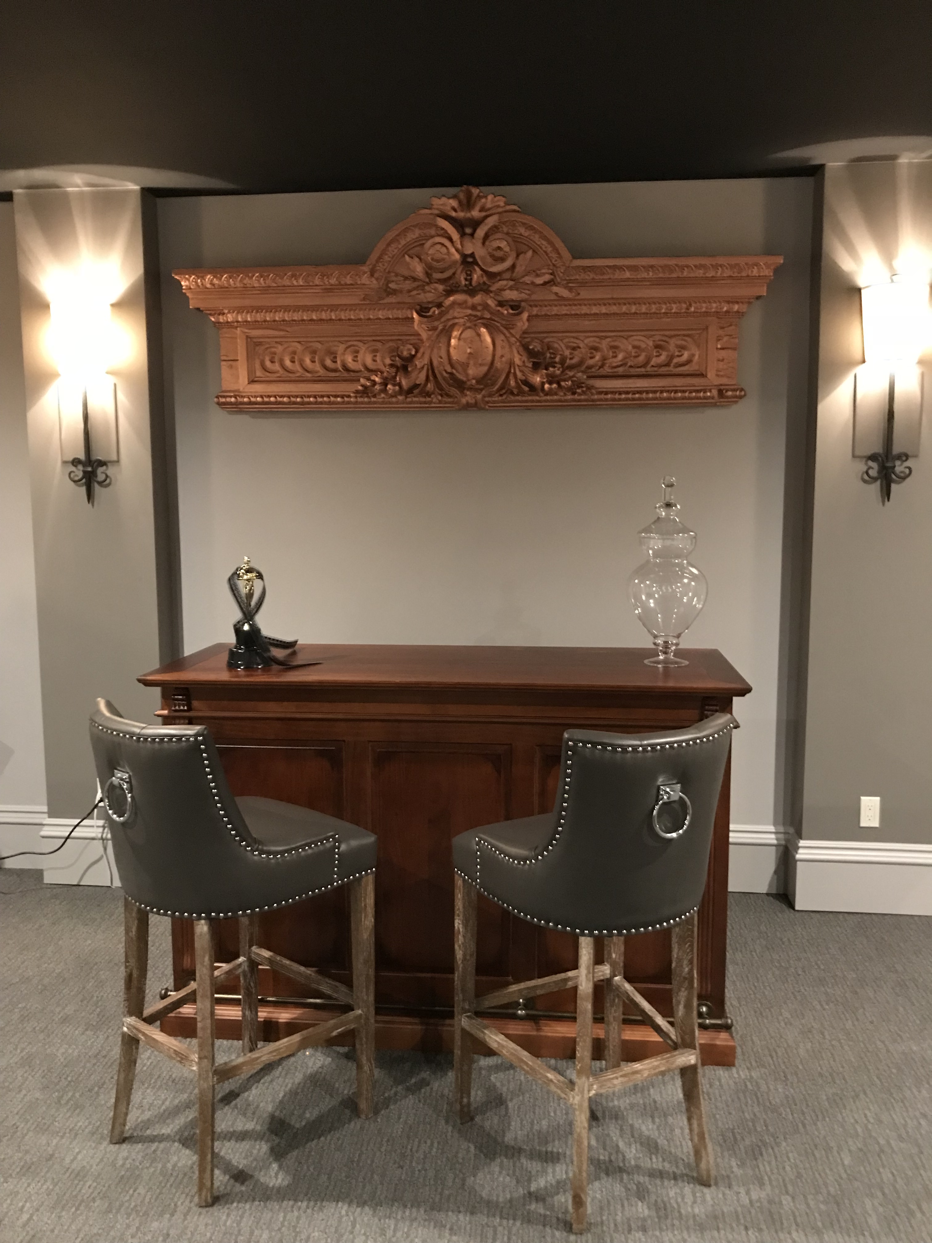
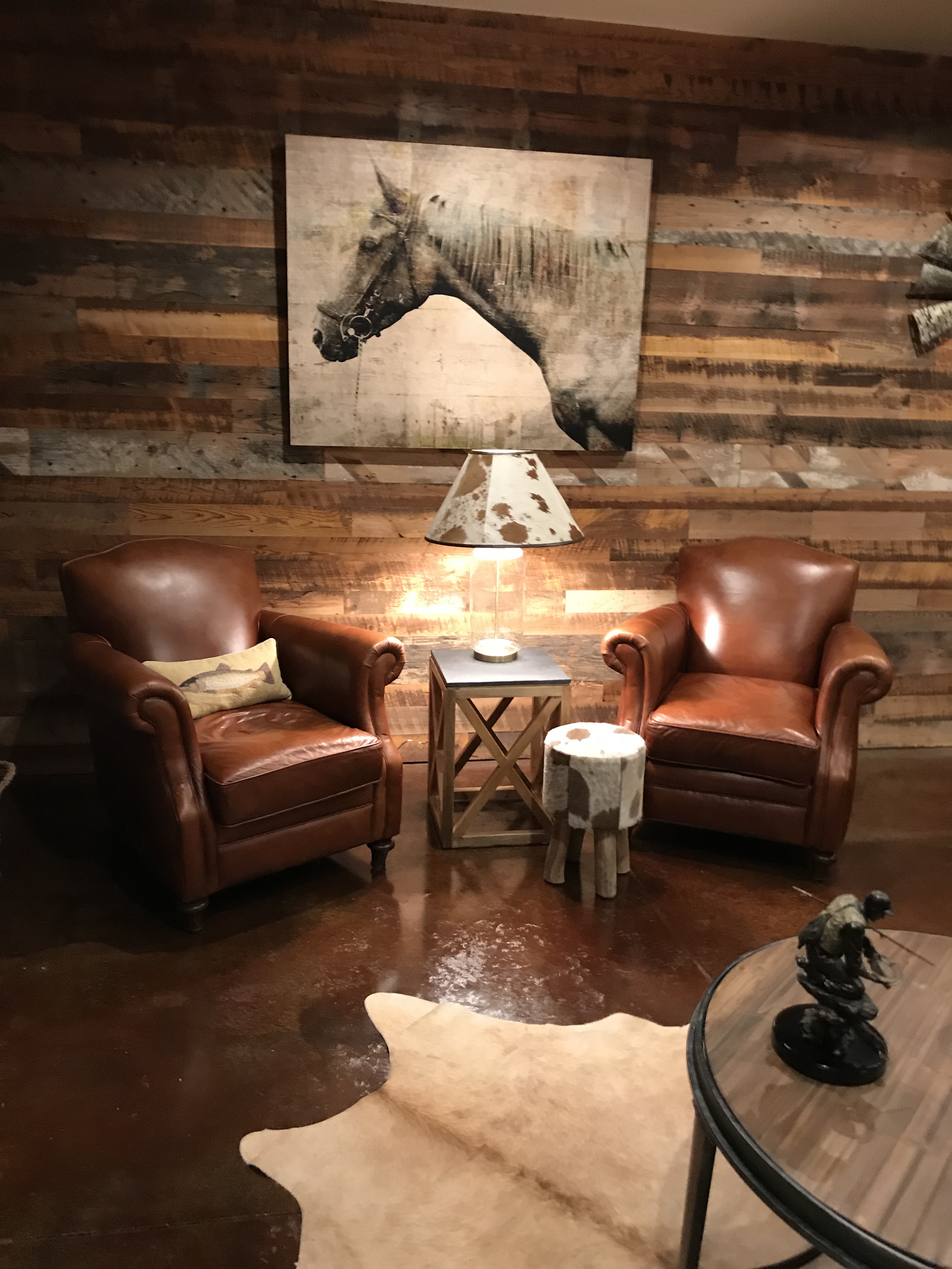
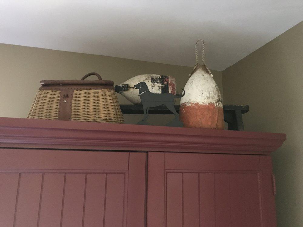
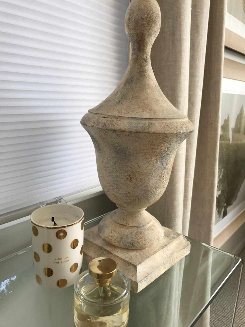
There has to be a balance and harmony when putting random objects together to create a visual display.  My key component is height – or several heights.  Here there are three objects that are rather large in of themselves.  If they were all at the same height, this would look cluttered and haphazard, but by elevating one of the two finials, it creates more drama.  The floral is in a container which has legs, again, giving this more height, but just slightly lower than the tallest object.

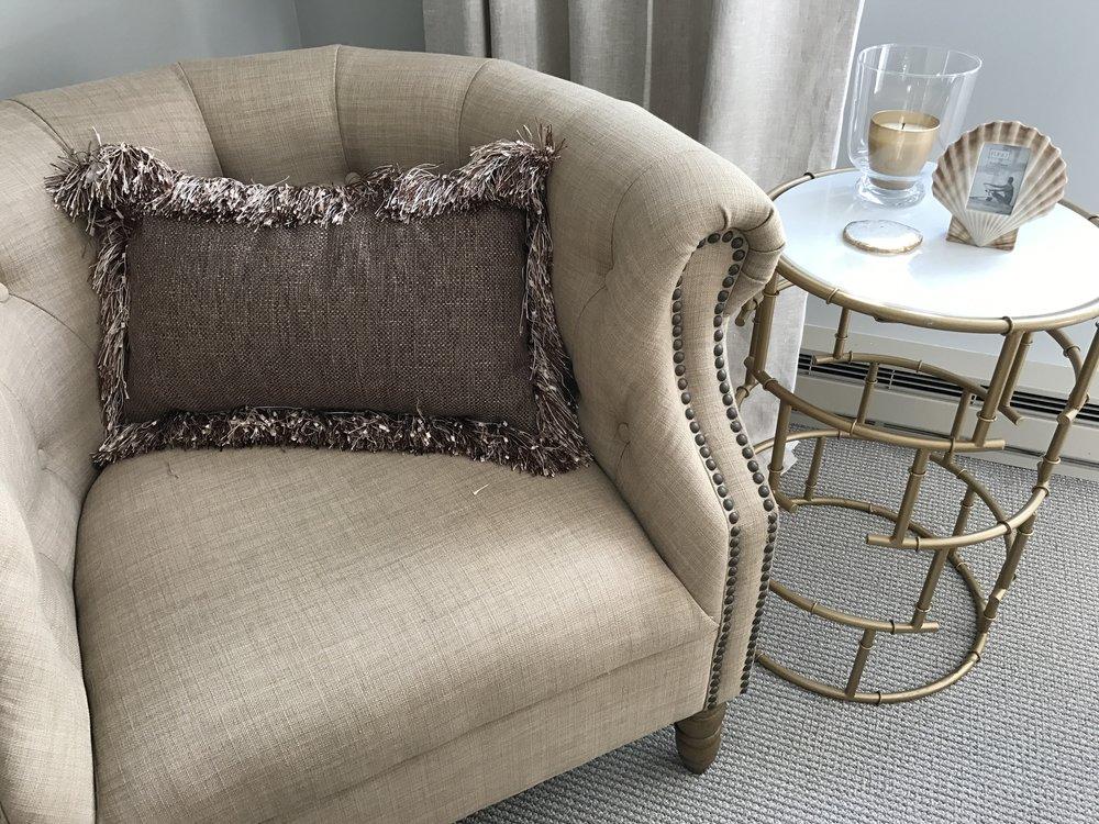
The general rule is odd numbers when placing smaller objects and try to keep in mind a commonality of the items grouped.  They should have a general theme or complement one another by color and/or texture.

Thibault Asian Print Fabrics

I have a weakness for Asian prints – you can probably see a pattern in some of my posts.  It really is a classic design mixed with traditional interiors, but also lends itself to a fun pop of pattern and color as seen in these new monotone designs from Thibault.

I especially love these ottoman ideas.  An ottoman is the perfect way to add that little extra bit of color or layer to your décor.  There is always room for an ottoman – whether used for extra seating, someplace to rest your feet or used as an extra casual “tabletop”, say for a stack of books or magazines.  Ottomans are probably the most versatile additions to a room.

Mudroom Re-do

I recently felt the need to freshen up my mudroom.   It had ticking striped cushions and a plain colored rug that mimicked the stripe on the cushions with a colorful stripe around the border.  I kept the woodwork paint color the same.  I was inspired by the rug you see here.  It really was my launching point.  I picked a yellow color from the rug and had the seat cushions recovered as you see here.  The green accents are tied together with whimsical pagoda throw pillows.  The pagoda vibe is repeated with the new hanging fixture.  The result is a colorful and welcoming space.  The rug functions well because it is meant to take a good amount of traffic, which this room truly gets.

Dining Room Re-Paint for Drama


Once again, the ‘winter doldrums’ in February had me itching to freshen up a room.  This time the dining room was my target.  I was inspired by a color I had seen in a magazine and immediately knew it was for me!  However, I was torn between a lighter and a darker version.  I’m usually pretty quick to make a decision since I am confident with what I like, but because this particular room can change dramatically depending on how much light it gets, I had to paint both colors on each wall and see how it reacted to various light conditions.  Ultimately I went with the lighter version and could not be more pleased.  I couldn’t believe what a difference it made.  The brown furniture and antiques just seemed to pop and the soft gold and creams in the window treatments became even softer.  I can’t emphasize enough how much a color can change the look and feel of a room.  I highly recommend playing with color.  If you’re hesitant, remember, it’s just paint!

Home Cinema


Instead of going with the typical “movie poster” theme for this home theater, I opted for various tints of muted greys.  We had to have some kind of sound absorption, so I went with upholstered panels rather than upholstering the entire wall.  This way they can be easily changed out if desired.  Also, rather than provide row upon row of theatre seating, I went with an enormous sectional and two large ottomans for lounging and one row up front of the reclining theatre seats.  Wall sconces provide dimmable lighting and a small bar in the back is convenient for serving food and drink.  See my links below for a fun popcorn machine to add the finishing touch!


Finished Lower Level Home Bar


I recently finished this home bar.  We used reclaimed wood for the back wall and behind the bar.  The floor is stained concrete in a rust color.  The bar itself has a live-edge top.  The front is covered with leather and rustic metal strips with nailheads, it is also underlit to give a complimentary glow.  The lights above the bar have an aged copper finish on the exterior and a soft gold interior.  The shelves behind the bar are created from reclaimed barn wood and are suspended from the ceiling.

The overall look is modern and industrial which may seem “cold”, but with the use of wood, old beams and the rich color on the painted walls and ceiling, it is warm and inviting.


A Breezy Screened-in Porch

Years ago, I used to dislike this rattan furniture, but as everything old is new again and rattan furniture, especially vintage rattan furniture, has become extremely desirable, so has my new found love for it!  I had it refinished in the spring and it looks brand new.  New cabana striped cushions and a glass top for the table which originally had a formica top give it a classic yet updated feel.  What makes this room work?  The repeat of the orange color, from rug, to accent pillows to the tray on the table.  Things don’t always have to be matchy matchy, as long as one color or theme is repeated here and there, the look will be complete.

A Summerhouse Boys Bedroom Update

This bedroom for a young man is in the same summer house that needed updating.  I started with a warm ‘paper bag’ color for the walls, then added crisp white linens with navy striping and other navy colored accents.  The theme was not to go too nautical, but instead try to create a “Tommy Bahama” California cool vibe.  What makes it work?  The unifying navy color for sure, but adding elements like the wooden water skis, some vintage accents and the ‘stuffed fish’ over the window really help to define this room.

This was my inspiration piece for this room. Everything followed from there.

Re-decorating a Master Bedroom

I have been bringing the bedrooms of a summer camp into the present day decorating-wise.  Regrettably, I did not take a ‘before’ picture, which would have shown the dramatic transformation.  Essentially, the room was a dingy beige-yellow with burnt orange carpet and drapes to match which had not changed in 40 (yes, 40) years!  A fresh beige-gray paint color and soft grey carpet were the foundation for this very serene room.  Linen drapes in a flax color frame the windows and various accent pieces with soft gold and glass complete the look.

Large prints stacked help to add height to the space.

Keeping accessories minimal and staying in a monotone color scheme add to the soft yet very glamorous treatment that this room received.  All white on white linens with the classic greek key design result in a light and breezy feeling for this summer bedroom.

What makes it work?

Below are closer looks at some of the elements in this room.

Re-styling a traditional chair

Well I guess this is a “which came first scenario – the chicken or the egg”.  Often I come across fabrics that I just fall in love with and have to find a use for!  I was super inspired by the ginger jar fabric in the bright lime green and blue, and as luck would have it, I came across this chair that is in great shape, but has an otherwise very dated fabric.  Unfortunately, the ginger jar fabric pattern is just too large – darn!  But I did find others that are equally as great, and am having a hard time choosing.  I am going to paint the wood on this chair a very glossy black and want a bright fabric that will pop against it.  The fabric choices I have narrowed it down to are below.  Stay tuned…..


Well the dark navy fish won out – and here is the result!  The white gimp creates a loud contrast against the gloss black frame.  I couldn’t be more pleased.